Mitsubishi Eclipse 3G Club banner

Updated... New Pics. My Fire-N-Ice Eclipse

6.5K views 78 replies 48 participants last post by  ICEMAN99TURBO  
#1 · (Edited)
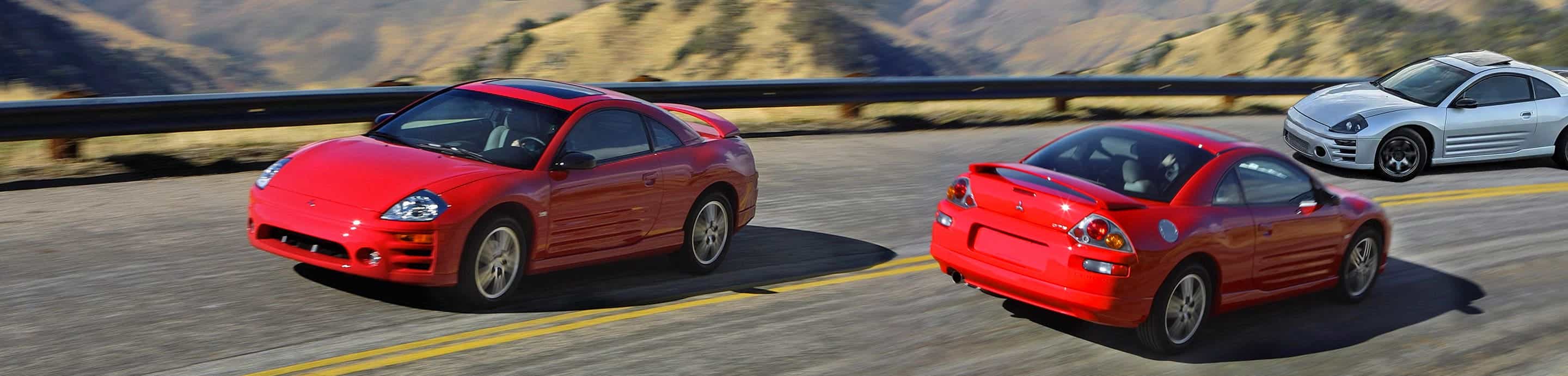
Just updated my Cardomain site. A few updates also. More to come. Umm. yea... Please Leave a message and let me know what you think.


<center><embed src="http://www.dropshots.com/dropshotsplayer.swf" Flashvars="url=http://www.dropshots.com/photos/94845/20060330/153502.flv&post=1" width="320" height="310" type="application/x-shockwave-flash" pluginspage="http://www.macromedia.com/go/getflashplayer"></embed><br /><a href="http://www.dropshots.com/"></a></center>
<IMG 67 l>

http://www.cardomain.com/ride/489498

Image


Image
 
#4 ·
thecrow1414 said:
looking good matt. can't wait to see it btn again this year
ditto, where ya been?
 
#5 ·
Eclipsed01 said:
and I call it a bucket of yuck...
see it in person and say that, the pictures just dont do it right.
 
#12 ·
Not much for the bomez. why did you go from ice to fire? and not fire to ice. The flames are backwards. but the car is pretty sweet.
 
#21 ·
Thanks guys... There is 19 layers of paint. House of Color Royal blue and Sunburst orange over Marble. It took almost 3 months to paint

3 layers base
3 layers of black
1 layer of marble
6 layers of blue and orange
6 layers of clear
Countless number of wetsanding thru-out painting for serious depth of color.
 
#22 ·
slwdwn3g said:
Not much for the bomez. why did you go from ice to fire? and not fire to ice. The flames are backwards. but the car is pretty sweet.
Was going to do that way but she needed to be different and that is what wins shows. Being different. Nobody has done the reverse flames before :idea: Fits my personality perfectly...
 
#25 ·
Steph said:
I don't like the amount of metallic in the paint, but that orange/red color would be bad ass over the entire car minus the heavy metallic. :) To each his own- I'm a plain jane kind of girl. Very unique looking car! What gave you the idea for the paint job?
The original idea/design I had kept looking like a chickens foot and a friend of mine suggested that I try the flames. and after several tries foward. it didn't look right on a eclipse. The reverse fit... Also I did not use metallic anywhere in the paint. I felt that would take away from the depth of the paint that I was trying to get.

Image
 
#26 ·
twntyball said:
The original idea/design I had kept looking like a chickens foot and a friend of mine suggested that I try the flames. and after several tries foward. it didn't look right on a eclipse. The reverse fit... Also I did not use metallic anywhere in the paint. I felt that would take away from the depth of the paint that I was trying to get.
What is the shiny stuff "under" the paint? The part that looks like it's crinkled. I thought that was metallic something or other because it's reflecting so much light.